Wine Bottle Packaging
Project Brief
The purpose of this project was to create a package design for a bottle. I had to be able to communicate the essence of a product with a given theme. The design had to have a series with seperate but equal components diffrientiating it. I had to accomplish all of this while also thinking about the appeal and the on shelf impact the packaging has. Meaning, how do I compel the customer to reach for my product rather than the others on the shelf.
Concept Brief
“See no evil, hear no evil, speak no evil.”
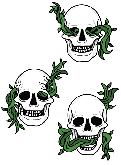
I needed to design a series of beverage containers in threes. The three I chose was “See no evil, hear no evil, speak no evil” I chose to create a white wine in a wine bottle. My target audience was a professional crowd that leaned more towards 50-60s. I wanted to incorporate evil in some way so I used skeletons to symbolize that. In my sketches, I included vines to represent the wine aspect of things i.e the vineyards wine is made in. The vines are designed to enter three different areas being the mouth, the ears, and the eyes. In the end, I chose to combine those two concepts and out came my final design.
First Sketches and Digitals
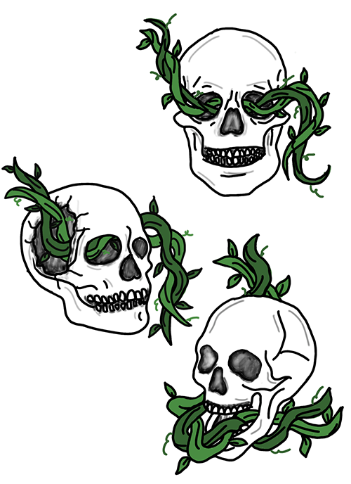
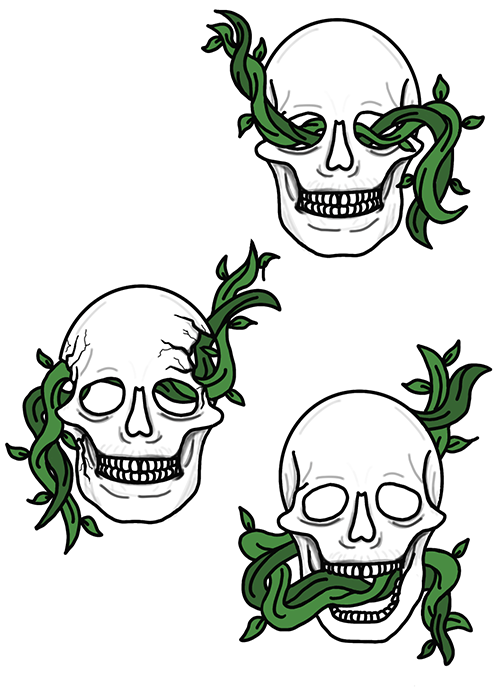
These are the first sketches and first set of digitals I did. Moving from sketch to digital I changed the perspective of each skull to be frontal, I felt it was more of a system this way. At this point I was deciding how I wanted to have the inside of the skull to look as well.
First set of Labels
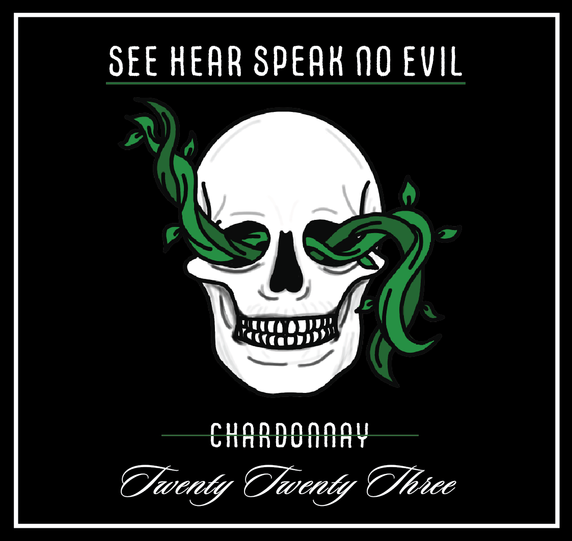
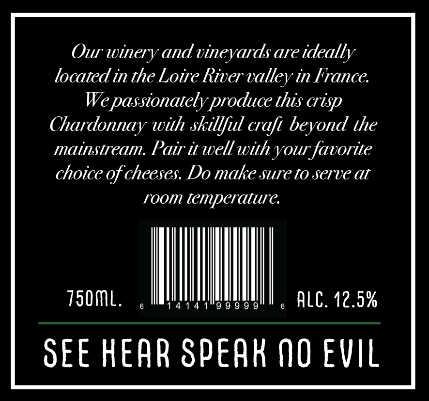
After I perfected my digitals I moved onto creating my first set of labels that will be placed onto my bottles. At this stage I decided that wine in a regular wine bottle would best fit the style i'm going for. I also decided on what type of wine I wanted each bottle to be and I wanted it to change for each. Also, I created a back label that pulled the customer in but I was still working on the exact layout I wanted everything to be.
Final Set of Labels
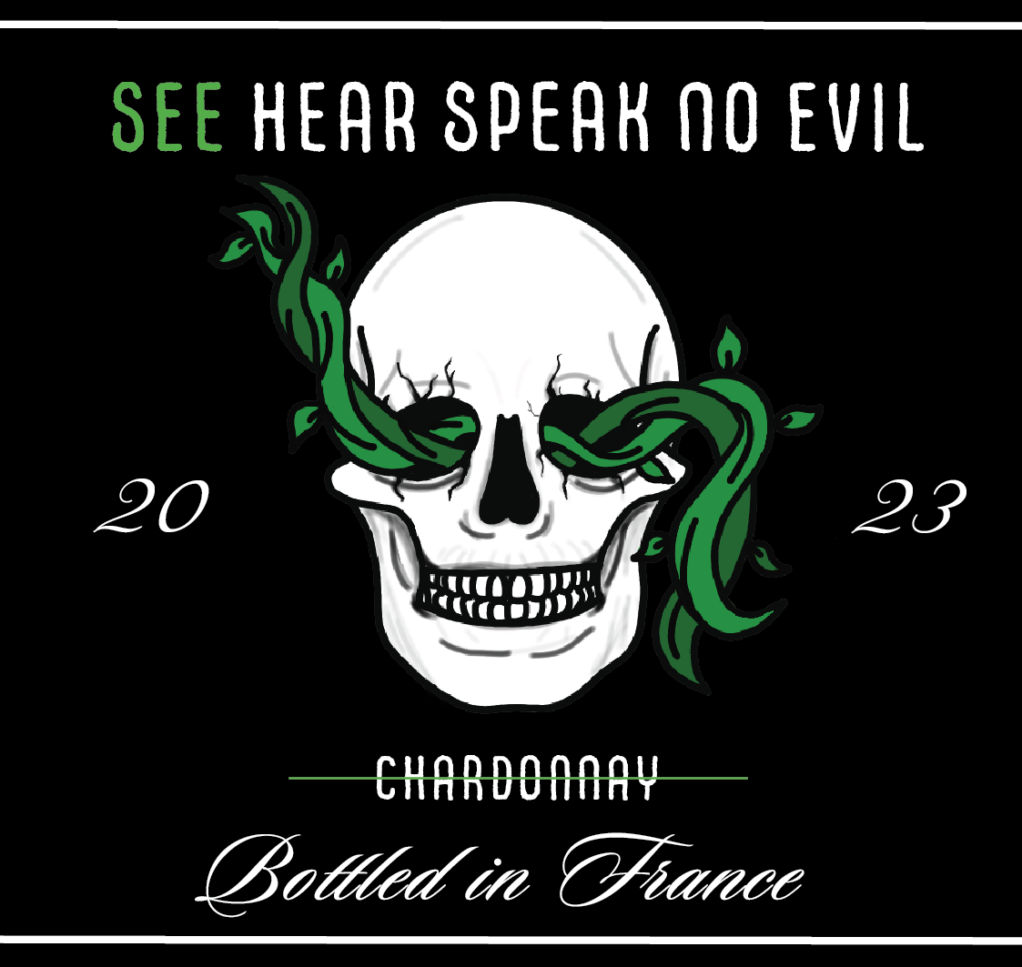
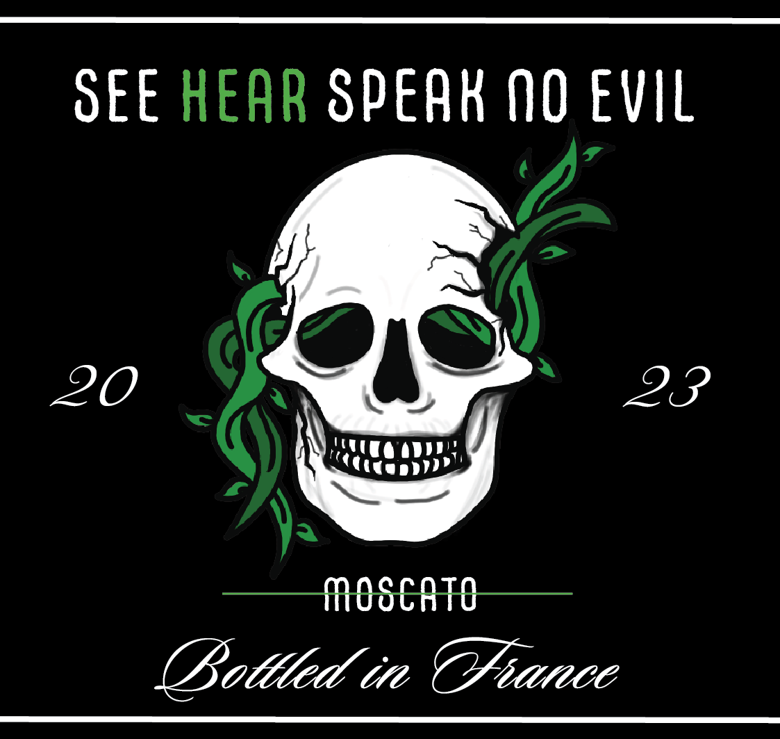
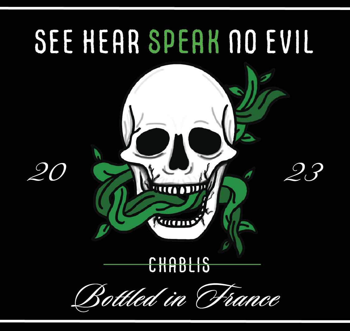
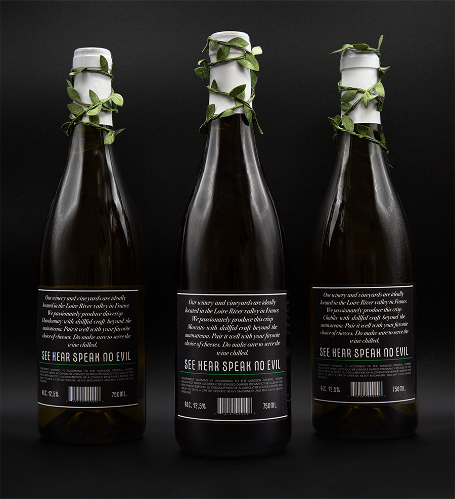
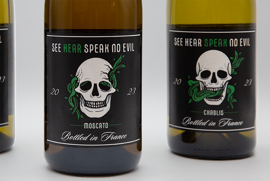
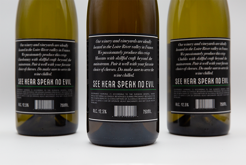
This is my final set for the front and back labeling of my wine bottles. I deleted the underline of the title and added a highlight of green to mark the see, hear and speak. I also added "Bottled in France" and changed the year to be on the sides of the skull. I changed the border from boxing everything in to a more open feel of just two lines, one at the top and one at the bottom. For my back label I found a layout that satisfied me and I thickened the green line across. I also changed the directions for the wine usage to be chilled instead of room temperature.
The Final Outcome
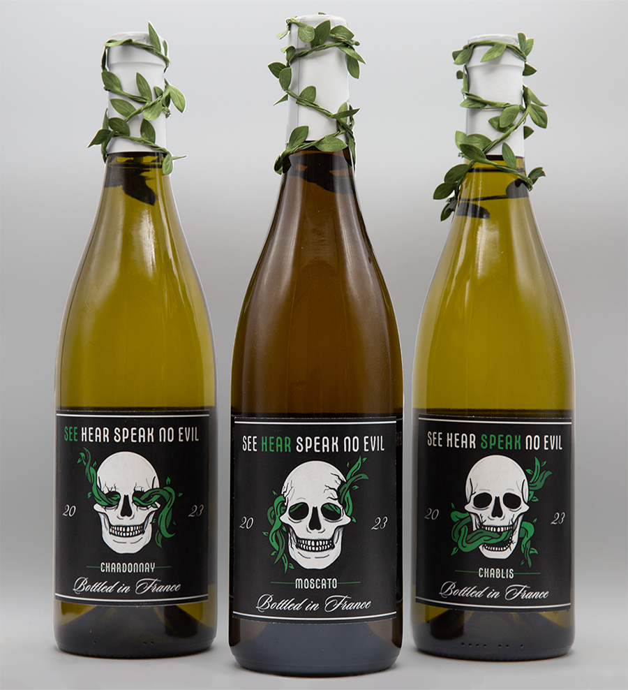
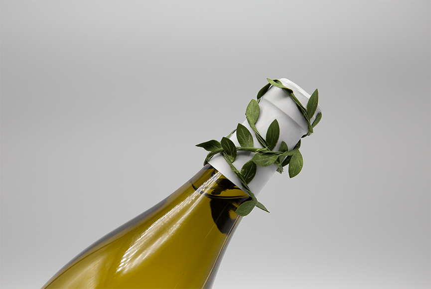
This is my final comp of my wine bottles. I added greenery to the cork top and I think it added to the evil feel I was going for. I photographed in two different backgrounds to show the effect the difference made.
Conclusion
All in all I loved this project. There was a lot of work and constant changes that went into this project. It made me appreciate all the time, effort, and hard work that goes into creating packages for products. It genuinely peaked my interest into continuing on with this line of work in the future. Over all, while this was challenging and a lot of work the product that came out in the end is something I am truly proud of.
